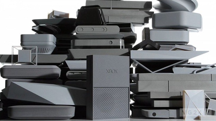
I always love seeing what designs are knocked around before a console settles on its final look. Or until a slimmer version arrives. The Xbox One was no stranger to this design process, going through a heap of concepts and ideas before settling on the Betamax version. Here’s what some of those designs looked like.
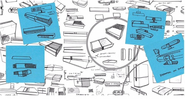
There were a ton of designs thrown around, ideas which Xbox creative director Carl Ledbetter described as having an "understated" and "approachable” philosophy at the Microsoft’s Worldwide Partner Conference 2013, via Polygon.
We wanted to make it simple and elegant, and we wanted it to be crafted and tailored, so it’s all about quality. Using those principles, we started to design.
30 people then came up with sketches that were sent to be modeled into actual shell prototypes, which were then tested in actual living rooms. Because y’know, I need something that matches my 1970s Blaukpunkt radio and amp perfectly. Once a design was chosen, the engineering team was then tasked with making the innards of the Xbox One fit inside the casing.

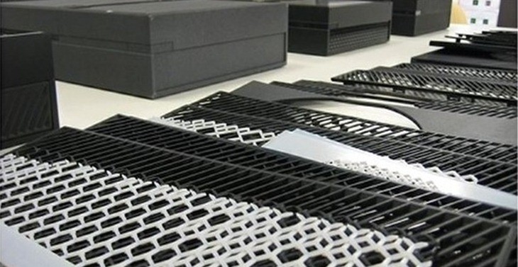
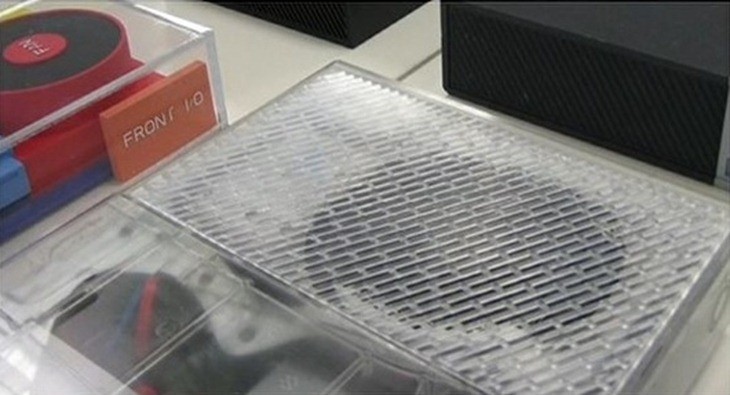
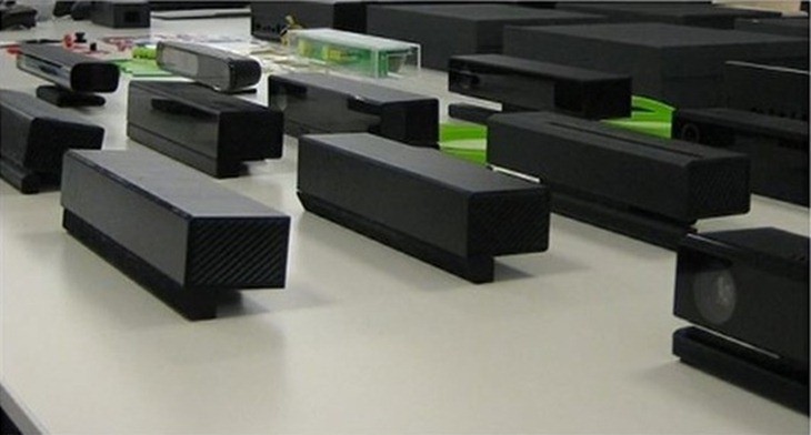
"The design you see here, this is where we start to apply things like gloss and matte finishes" Ledbetter said over some slides.
This is where we start to apply things like gloss and matte finishes. How does the vent pattern look? How does the brand come through the front? How do we make the font look high quality, just like the high definition televisions in people’s living rooms?
As for the Xbox One controller, Ledbetter mentioned that over 200 prototypes had been created for that input device. “We found that, when people put these in their hands, could tell the difference between a 10th of a millimeter in size," Ledbetter said.
I like the Xbox One. Sure, it’s plain, but it’s a hell of lot better than the design of the Wii U, which is essentially a giant brick in terms of next-gen imagination.
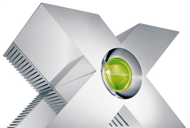
And it’s still better than this design:
Last Updated: July 11, 2013















DBL_ZA
July 11, 2013 at 12:13
Don’t really like glossy finishes. While the idea is nice, you inevitably end up with fingermarks all over the thing. Just ask my gloss-finished keyboard -_-
More related, when I first saw XBONE, this was all I could think of:
http://news.cnet.com/i/tim/2011/02/08/Dell_OptiPlex_790_Family_1_610x569.jpg
Guest
July 11, 2013 at 12:14
I thought their first designs were bigger and more shaped like machines that could rape customers. Guess not.
John Ambitious
July 11, 2013 at 12:17
Check these…
http://www.businessinsider.com/xbox-720-ps4-designs-2009-12?op=1
Kromas
July 11, 2013 at 12:29
I shall wait for this X-Box design thanks.
Guest
July 11, 2013 at 12:44
I dunno… I kinda like the big “X” design. It screams “I’M A GAMING DEVICE”