Bear with me here, because this may sound like non-news, but to me it’s actually something. When it comes to comic books, you can’t deny that the industry is dominated by two players: DC Comics and Marvel. Comic book publishers which have very distinct identities and characters that they’ve built massive multimedia empires around. And these are two companies that in many ways, are defined by a single logo. Take a look at Marvel for instance:
And then there’s DC, which has been using this logo since 2012:

And that logo is simply awful. It looks like somebody bought ham from Woolworths and is peeling the packaging open to get some porky goodness. It looks like a discarded condom wrapper. It reminds me of that cup of chocolate mousse I had for breakfast. Granted, the idea of a simple graphic that could be applied to multiple characters in the DC library was a terrific idea. Unfortunately, it was pulled off with the graphic design precision of using MS DOS Paint to create.
Fortunately, DC is undergoing a “Rebirth” in a few weeks, with a new logo that is coming along for the ride:
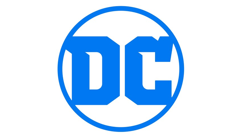
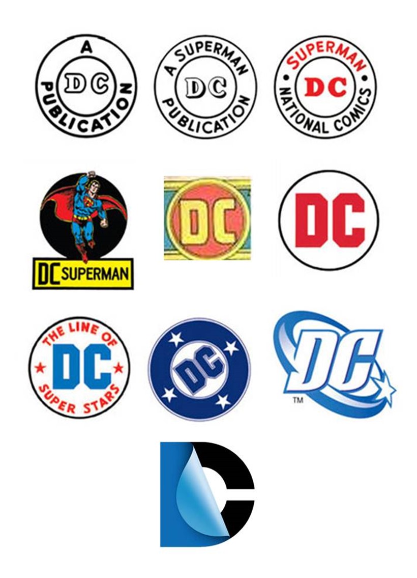
MUCH BETTER. The logo above is very much reminiscent of what DC plastered on their comics from 1972 and 1974, until 1976. In fact, here’s a collection of logos so that you can see the evolution of trademarks. Please don’t sue me Warner Bros.:
“While comics continue to be the heart and soul of DC, the brand has evolved to now stand for powerful storytelling across so many different forms of media,” DC Entertainment Senior Vice President of Marketing and Global Franchise Management Amit Desai said in a press release while I wondered how much space is left over on his business card with a title like that.
DC is home to the greatest Super Heroes and Super-Villains, and the new logo has the character and strength to stand proudly alongside DC’s iconic symbols. The launch of the new logo is the perfect tribute to DC’s legacy, exciting future and most importantly, our fans.
“I’m very proud that ‘Rebirth’ will be the first comic book published with the new DC logo,” DC Entertainment’s Chief Creative Officer Geoff Johns added.
To me, ‘Rebirth’ and the new DC logo are built on what’s come before while looking to what will come tomorrow. I can’t wait for people to see it on the cover.
Simple and to the point. And probably earning the graphic designers responsible for it an obscene amount of money in the process as well. I’m in the wrong industry. Be right back, I’m going to redesign the Lazygamer logo with a Comic San font that is extra-bold.
Last Updated: May 18, 2016








Gavin Mannion
May 18, 2016 at 14:02
Better? It looks like it was designed by a 3 year old with a spare crayon.
Pariah
May 18, 2016 at 14:03
Yeah that’s perfect. It now matches the comic books. 😀
Pariah
May 18, 2016 at 14:02
“from 1972 and 9174”
Wow. DC is OOOOOOOOOOOOOOOOOLD
Alien Emperor Trevor
May 18, 2016 at 14:05
The “C” looks like a deformed balloon animal.
Pariah
May 18, 2016 at 14:05
I don’t see it. But, it takes one to know one, and all that.
Raptor Rants
May 18, 2016 at 14:48
Soooo… You’re saying it blows?
Raptor Rants
May 18, 2016 at 14:47
That looks like the logo of some american football team or something.
Darren Peach
May 18, 2016 at 15:13
Less is more. New logo sucks.
Strawman Jim
May 18, 2016 at 20:04
The one in the middle (third row) is the one I remember from when I was still collecting comics and graphic novels. That was DC for me, but then I’m old, grumpy and not a rainbow-haired easily triggered little hambeast (so no longer the target demographic).
Bah humbug!
http://i2.wp.com/www.lazygamer.net/images/2016/05/DC-Comics-logos.jpg?resize=820%2C1135